My personal website was already built with Astro and had very little JavaScript, but its Largest Contentful Paint (LCP) was still slower than I wanted. After investigating, I found that fonts and images were responsible for much of the problem. Here’s what I changed and how I decreased LCP by ~50%.
The Importance of Performance
If you go read my short write-up on this website, you will find that the first goal I had when creating this website was: speed. The best way to have a quick website is to serve as much content as possible as static HTML. With static site generation, the HTML is generated ahead of time during the build process, so the browser doesn’t need to execute JavaScript to construct the page. Astro lets me build pages from components while shipping mostly static HTML to the browser (there are a few exceptions on this site, namely interactivity). Interactive components can still use JavaScript when I need them. You can read more about Astro here.
Apart from me wanting this site to be quick and performant, why else does a website need to be performant? The main reason for this particular site is poor performance often creates site abandonment. That is not ideal whatsoever for me, who wants people to get to know about me and explore what I’ve worked on. Other reasons include poor conversion rates and loss of users. Mozilla has a great in-depth article here. I believe that it is our responsibility, as developers, to create software that is as performant as possible (also, it’s a fun challenge).
Measuring Performance
Okay, so how do we measure performance? There’s a few different metrics that I want to highlight. First Contentful Paint (FCP) measures when the browser renders the very first bit of content, like a logo or a line of text. Largest Contentful Paint (LCP) measures the render time of the largest visual element in the viewport (such as a hero image or primary heading block). LCP is what I focused on the most when working on these optimizations, as it most accurately reflects what users experience. Cumulative Layout Shift (CLS) is another metric, which measures unexpected movement in the DOM. You can read more about these metrics from Chrome for Developers documentation.
I used Google’s PageSpeed tool to measure the performance of my changes in a standardized way. Chrome’s DevTools also contains a Performance tab that measures a lot of the attributes I touched on, as well as offering flame graphs to analyze what is going on under the hood.
Initial Values
So, here are the site’s initial values from PageSpeed:
| FCP (s) | LCP (s) | CLS | Speed Index (s) | Performance Score | |
|---|---|---|---|---|---|
| Desktop | 0.8s | 1.0s | 0.046 | 0.8s | 98 |
| Mobile | 3.2s | 5.3s | 0 | 3.2s | 74 |
Mobile is much worse, in terms of speed, but PageSpeed throttles the download speed on Mobile testing devices to be 1.64Mbps, which is intentional to simulate a consistent lab experience. The desktop download speed on PageSpeed is throttled at 10.24Mbps. For reference, the average 5G connection can download at ~310Mbps and a fiber connection is capable of 1,000Mbps. So, these download speeds can help diagnose issues that are not noticeable on the good connections I am fortunate enough to have.
Investigating the Problem
So, as I touched on, I relied on Google’s PageSpeed tool for the baseline values that I tried to optimize. For testing my local changes, I heavily utilized Google Chrome’s DevTools, primarily the Performance tab.
The Performance tab in DevTools works closely with the Network tab. I made some changes in the Network tab to accurately test. First, I disabled cache by checking “Disable cache” checkbox. This prohibits Chrome from serving the webpage from its cache, allowing it to fully fetch the webpage on each request, rather than showing cache and then replacing it. I also messed around with the throttling dropdown to the right of the cache checkbox. This allowed me to emulate different internet speeds while testing (similar to how PageSpeed works).
To test, I used “Record and Reload” in the Performance tab to capture a page load, then inspected the resulting timeline to see when resources were requested, when the browser was able to paint, and which work was happening before FCP and LCP. With this information I dug into what was going on under the hood.
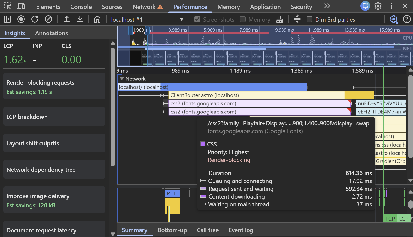
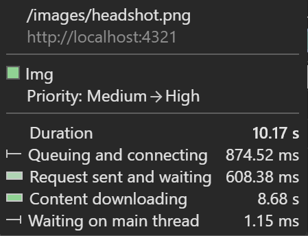
I found that my requests to retrieve the fonts used on my website from Google Font’s CDN were in the critical path, blocking painting of the webpage. I also discovered that the fetching of some of my images from their directory took a long time. My headshot on the landing page was so large (516KB), it took nearly 10s to load. By doing this, I found that there were potential savings of up to 1.2s through improving font fetching and 690KB in image delivery.
Here’s a video showing the loading issues on a throttled internet connection (slow 4G):
Optimizing Fonts
I mentioned that I used Google Fonts to get the fonts for my website. This was due to the convenience of development, deployment, and consistency between different environments. By using the Google Font API, you no longer have to manually create and tag font files. A drawback of using the Google Fonts API is that the browser has to make network requests to Google’s CDN to retrieve the fonts when they aren’t already cached. In my case, the bigger issue was that the font requests were part of the critical rendering path. Moving the fonts onto my own site removed that external dependency and reduced the work required before the page could render. Additional network requests can be expensive, especially when they’re on the critical rendering path. The way to avoid external requests is to serve the fonts locally, where the pages are hosted.
Luckily, Astro offers a way to do that. You can read more at this documentation, but, Astro effectively takes the font you configure, downloads it at build time, and bundles the font into a local font file. Since it is served locally, there is no reason for the client to ask Google Fonts, for the font, each time my website is loaded. In my case, this also eliminated the CLS I was seeing on desktop. With the font available earlier in the loading process, the page no longer experienced the layout shift I had observed while the font was loading.
Here is an example of using the Astro Fonts API:
// astro.config.mjs
import { defineConfig, fontProviders } from 'astro/config';

export default defineConfig({
  fonts: [
    {
      name: 'Playfair Display',
      cssVariable: '--font-playfair-display', // Set the CSS variable of this font
      provider: fontProviders.google(), // Google Fonts as the provider
      weights: ['400 900'], // Font weights of 400 -> 900
      styles: ['normal', 'italic'],
    },
  ],
});
---
// main.astro
import { Font } from 'astro:assets';
---
<head>
<Font cssVariable="--font-playfair-display" preload />
</head>
<body>
<h1>Hello World!</h1>
</body>
<style>
h1 {
font-family: var(--font-playfair-display);
}
</style>Optimizing Images
Initially, I was using normal <img> tags in my HTML to render the images. This is fine, it’s the intuitive way to do it, but, there are drawbacks if you’re trying to be as efficient as possible. The <img> tag fetches the entire image whose path is passed into the src attribute. This is problematic because if an image is several thousand pixels wide but is only displayed at a few hundred pixels wide, the browser may download significantly more data than is necessary to display it. Also, JPEGs and PNGs can often be compressed significantly, and modern formats such as WebP can reduce file sizes even further.
Once again, Astro has a built in solution for this. At build time, Astro can process the image, resize it, and generate an optimized format and size appropriate for the page. Astro’s <Image /> component will utilize the height and width passed into it to create really small files. The biggest offender was my headshot. The original file was 516 KB, while the optimized version was only 10 KB, a 98.1% reduction.
Here’s some image before and after sizes:
| Image | Before (KB) | After (KB) | Reduction (%) |
|---|---|---|---|
| WRG Logo | 70KB | 3KB | 95.7% |
| Hudl Logo | 20KB | 1KB | 95.0% |
| OU Logo | 31KB | 1KB | 96.8% |
| Headshot | 516KB | 10KB | 98.1% |
Results
All of these optimizations improved my PageSpeed performance scores from 74 to 96 on mobile and 98 to 100 on desktop. The changes resulted in a ~50% reduction in my website’s LCP across both mobile and desktop. The largest improvement was in mobile’s FCP, going from 3.2s to 0.8s, a 75% reduction. I also eliminated the CLS that was observed on desktop by optimizing the fonts. You can check out the PageSpeed results from before and after by following those links (by the time you click them, there’s a good chance my site looks a little different).
| Before | After | Improvement | |
|---|---|---|---|
| Mobile FCP | 3.2s | 0.8s | 75% |
| Mobile LCP | 5.3s | 2.6s | 51% |
| Desktop FCP | 0.8s | 0.3s | 63% |
| Desktop LCP | 1.0s | 0.5s | 50% |
| Mobile Performance | 74 | 96 | +22 |
| Desktop Performance | 98 | 100 | +2 |
What I Learned
Could I have spent my day doing something better? Sure. But, I can say I learned a lot from the deep dive into the performance of my personal website (and my PageSpeed scores are all green now). Here’s some final takeaways:
- Measure before optimizing.
- A site with little JavaScript can still have significant performance problems.
- Looking at the network waterfall was more useful than blindly chasing a PageSpeed score.
- Large images can have a much bigger impact than expected.
I hope you enjoyed this post, reach out to me with any questions/thoughts through any socials I have linked!